
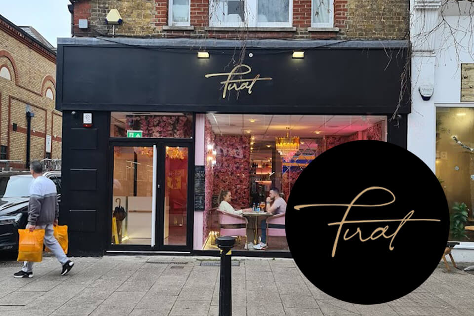
‘Daddy, can we go to Twat, pleeeeease?’ I was confused. This were not a word I expected to come out of my 9-year-old’s mouth and I definitely wasn’t happy about it. But then, as a toddler he’d often ask for his ‘fokkin knife’ (no amount of repetitive modelling could convince him it was a knife and fork). He stood pointing, in awe and amazement at ‘can we go there pleeeeeeaaaaase’. I saw a blur of pink flowers and was still very confused. ‘Who’s a twit? I ventured?’ ‘Not Twit daddy, silly, T-W-A-T, there’ joined in the 7-year-old, also pointing at the glow of pinkness in front of us. I pondered how I was going to explain this one to their Mummy. I followed the boys’ pointing fingers and looked up. The shop front did indeed seem to proclaim its name to be twat. ‘It’s not open I ventured, let’s go and find Mummy’. We found Mummy. She laughed. Apparently, we were not the first to believe that the hottest new and very instagramable venue in our local town of Bishop’s Stortford had a somewhat offensive name.
So what went wrong? Or right? It came down to typeface. The new bistro, actual name Firat, opened recently in the centre of Hertfordshire town Bishop’s Stortford. Named after its owner we assume the purpose of the chosen font was to offer the feel of a signature. Was this an honest mistake, did nobody spot the potential for mis-reading the business name in the curves of the font or was it a genius marketing move to encourage us all to talk about this new business? If it was the latter, it worked!
Firat, we wish your business every success, we’ll certainly remember to come for a visit after the giggles our mis-reading of your name gave us!