
What a week of re-brands.
Two big household names, John Lewis and charity RNIB have announced re-brands in the last week and that’s not the only thing they have in common. The re-brand world has gone black and white.
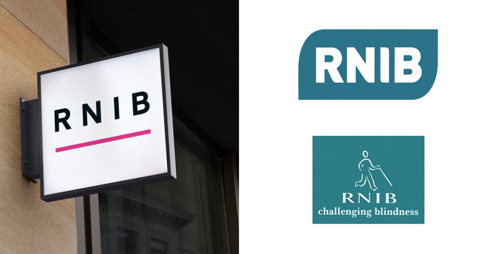
RNIB Brand history
As far as name changes go the RNIB has had more than a few in its 150-year history. The charity has continually re-evaluated in line with changes to its purpose, function and vision.
1868 the British and Foreign Society for Improving the Embossed Literature of the Blind
1869 the British and Foreign Blind Association for Improving the Embossed Literature of the Blind and Promoting the Employment of the Blind
1869 the British and Foreign Blind Society for improving the embossed literature of the Blind and promoting their employment
1869 the British and Foreign Blind Association, for improving the Embossed Literature, and promoting the employment of the Blind
1871 the British and Foreign Blind Association for Promoting the Education and Employment of the Blind
1914 The National Institute for the Blind (NIB)
1953 Royal National Institute for the Blind
2002 Royal National Institute of the Blind
2008 Royal National Institute of Blind People
The history of the name changes indicates simplification of the brand over time. The visual launch of the RNIB re-brand today succinctly highlights that evolution.
‘See differently’ Creating a great tag line
The tag line says it all ‘see differently’. Not only are they viewing their own brand and its work differently but challenging the public to see sight loss differently. With the simplification of the name and the visual identity the new tag line works hard to offer more depth to the brand and challenge in a non challenging way. Words are often forgotten in re-brand but this is a great example of a tagline bringing the whole brand together. See Differently has so many different connotations and interpretations giving the charity breadth in its marketing to explore.
What has changed?
The visual brand evolution clearly reflects the shake-up the entire charity has undergone. There is a clear movement to disassociate from thoughts of NHS, healthcare, treatment and the like with a distance from the colour palettes which retrospectively make you think that the external brand focus had been there too.
But is it brave?
Sticking 4 letters above a pink line on a page and calling it a logo. Absolutely. Re-brands are always open to criticism and keeping it so simple always encourages debate.
Why is it so brilliant?
Instantly recognisable. We’ve all sat in a darkened room being circled by an optometrist and being asked to make out faint black letters on a white screen. There is clearly an influence from the part of sight we all understand, eye tests. The brand immediately gets you thinking about sight, moving thoughts into an area you understand and can relate to. The logo takes you quickly to this place allowing the brand to explore
Readability. For a charity focussed on people with sight issues making the brand so clear and readable demonstrates research and a connection with the audience the charity serves. The sans serif typeface takes away unnecessary fussiness and the wide spacing draws attention to the issues people with sigh loss might face.
Simplicity. The logo is essentially a demonstration of how to use fonts and spaces to make a brilliant logo.

RNIB rebrand in action
The campaign
The brand has rejuvenated in a fun and modern way. Awareness is raised through engagement and you are once again encouraged to connect with the brand and the people it serves. You are reminded to ‘see the person, not the sight loss’ with reference to Love Island, you watched it, so did they. ‘Clumsy ‘cos I’m Harry, not ‘cos I’ve got cataracts, a reminder that we can all be clumsy, it doesn’t have to be because of sight loss.
Our views
‘I have been asked so many times if there is a re-brand I wish I had done. This is now the one. I can’t actually contain my excitement towards the RNIB logo and re-brand as a whole. It is fantastic. I adore the simplicity of the logo, the thought behind it and the overall messaging of the new brand. It’s simply brilliant!’
Is your charity considering a rebrand? Contact us on 01279 800 033 or hello@thedesignchambers.co.uk