
We are often asked by clients how they can successfully unite their brands so that they are part of a family whilst also showcasing their individual characteristics.

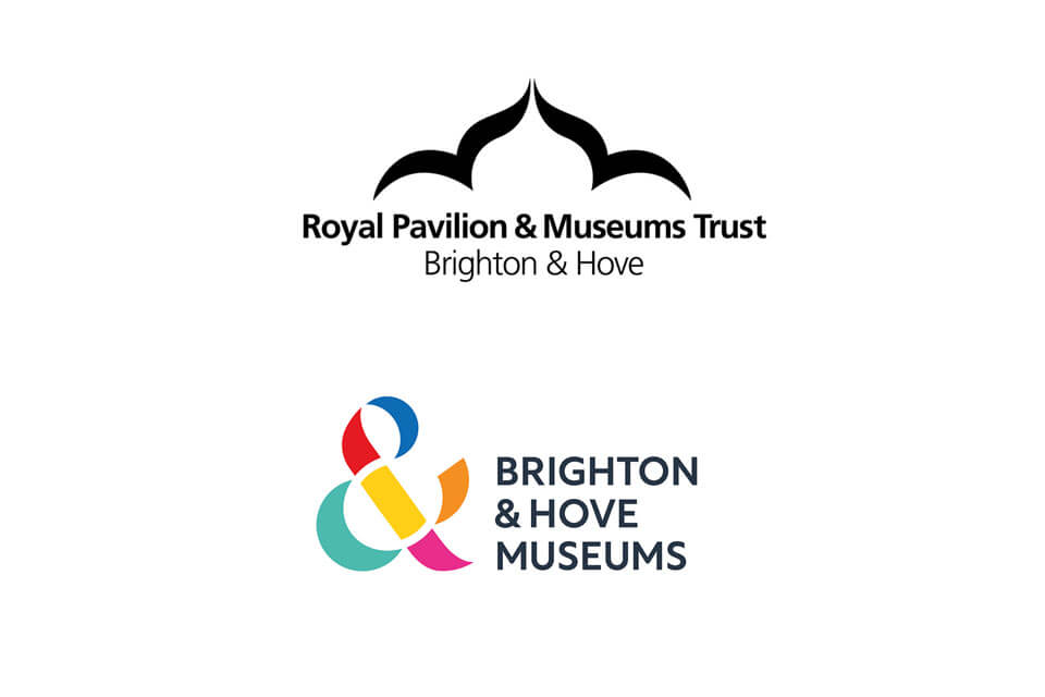
The result of the re-brand undertaken by Brighton and Hove museums perfectly demonstrates how brands can be brought together at the same time as celebrating their uniqueness.
Collectively the museums give access to manor houses, gardens, pieces of art, newspapers, historical objects, and, and, and… Utilising the ampersand from the name Brighton & Hove museums and attributing it to the vast array of things you can see and experience through the museums is a very creative and relevant way to draw the museums together.
Colour is an obvious way to further draw the brand together whilst allowing space for individuality. This has been done beautifully with this re-brand by giving each museum a colour within the logo which then feeds through into that museum’s brand.
The resulting umbrella and individual brands are vibrant, colourful and truly reflect the openness the museums wanted to portray.
We particularly like the use of white space within the ampersand logo. A subtle circle has been created in white to split the colours making the ampersand. We feel that represents the ongoing nature of history, creating interest for future generations. The circle also nods to the feeling of inclusivity the museums wanted to portray.
Seeing the brand in use across advertising hoardings for the museums shows how well it works. It is eye catching, shows the variety of things you can see and do at the museums and most importantly of all, it encourages you to look further, telling the onlooker that this museum is for them, for everyone.

If you need help bringing your brands together please get in touch with the team.