Do successful brand need to evolve their logos?
Whichever ranking you look at whether financial, number of fans or brand dominance Barcelona Football Club is one of the top clubs in the world.
So when your brand is at the top of its game why bother evolving the visual appearance of the brand?
What do your ‘fans’ think?
The club reports that the letters FCB don’t resonate with their supporters and had no real meaning for the brand. In the evolution the approach ‘if its not needed or wanted’ was taken and the letters have been omitted.
Does your visual appearance resonate with your vision and strategy?
By taking away FCB from the crest the football club are able to further explore the value of Barça to their extended brand. Barça is a term used by their fans and has more potential internationally to promote and grow the Barcelona brand.
Does your brand work digitally?
Whilst visually not much has changed the small changes the club has made to its crest make it more useable in the digital ages, elements can be extracted and moved.
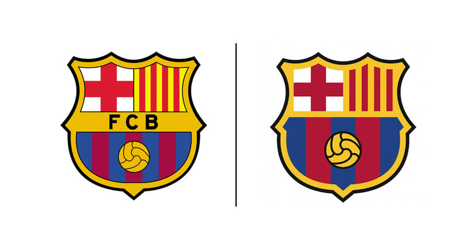
So, how has the crest changed visually?
The crest shows a history of evolution . Changes have always been about evolution rather than total change.
Without seeing the new and the old crest next to each other you are unlikely to ‘spot the differences’. The changes are subtle but each has its merit.
The football has been given more emphasis, a good thing for a football club. It’s slightly bigger and the outline is bolder. Putting the football as the crest focus has even more importance as the brand strives to grow outside of football.
The colour palette has been reduced. The old crest colours felt uncomfortable. The colours didn’t work together and made the crest feel disjointed and a little cheap. The new palette colours all work well and complement one another.
The number of stripes has been reduced. This gives an over all impression of more blue and garnet (the burgundy colour – not one we’re familiar with either) within the crest, aligning again to the recognised colours of the club seen in its kits.
The letters FCB have been removed leaving more space for elements and allowing simplification of the crest.
Black outlines have been removed giving the crest a more modern feel and allowing each element of what is still a busy crest to breathe.
Football is no longer a game, it is a brand with major brands within it. Barcelona is one of those major brands. The subtle changes to the crest show the world that Barça respects its heritage but is positioning itself to be an even bigger brand of the future.
Our views
‘With Barcelona FC budgets, absolutely we would have made these tweaks and changes. Each one has been made with purpose and in line with the club’s strategy and vision. The crest hasn’t evolved for many years and the digital age has been the period in their visual identity’s history which has seen no change.’
Does you visual identity fit your strategy and audience? Contact us on 01279 800 033 or hello@thedesignchambers.co.uk


